

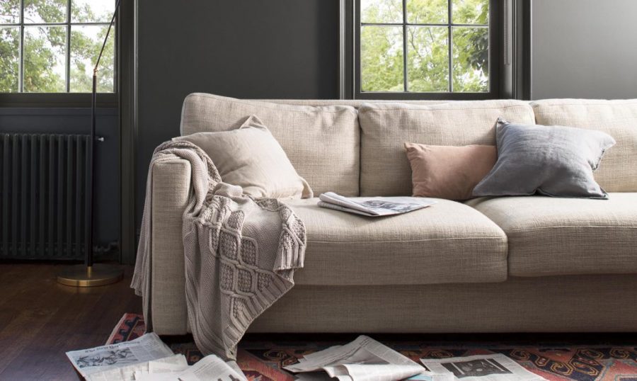
Every year paint companies release their colour predictions for the upcoming season. Think of it as the paint colour fashion awards. With my love of the colour grey I was over the moon when Benjamin Moore announced that the 2019 Color Of The Year was AF-690 Metropolitan.
Because greys have so many undertones, finding the right one can be tough (click here for tips on picking your perfect shade) but Metropolitan strikes just the right balance between too warm (beige) or too cool (blue). It has has a nice depth so it’s perfect for making large rooms feel cozier but not too dark that it can’t be used in smaller rooms too. In short – it’s pretty great!
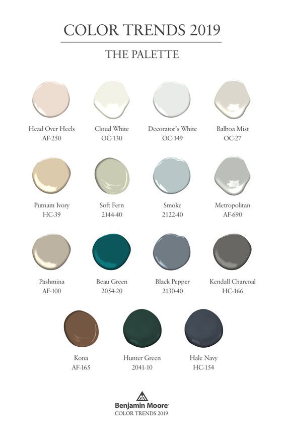
Benjamin Moore Metropolitan can be found the Affinity fan deck which is a collection of 144 colours that are designed to compliment and work well with each other. It’s just enough choice to give you a variety but not enough that you’re overwhelmed. Most of the colours are muted so think earthy moody colours instead of bright oranges, yellows and turquoises.
In addition to the colour of the year, Benjamin Moore also releases a small collection of additional favourite shades. I was thrilled to see a few of my favourites on that list too (hello Hale Navy)!
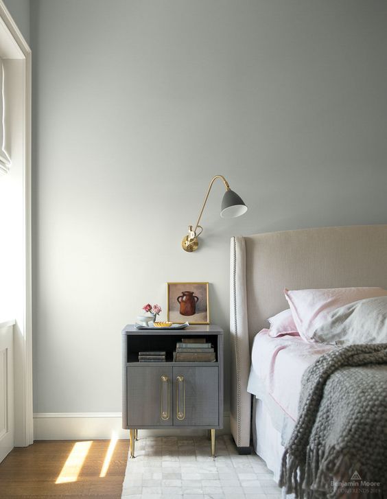
Need some inspiration on how to use Metropolitan? Let’s start in the bedroom – I love sleep so it’s my favourite room in the house. See how the colour is just dark enough to make the room feel relaxing without looking small and closed in? Also, I love that it’s been paired with soft pink fabrics and gold accents.
Navy
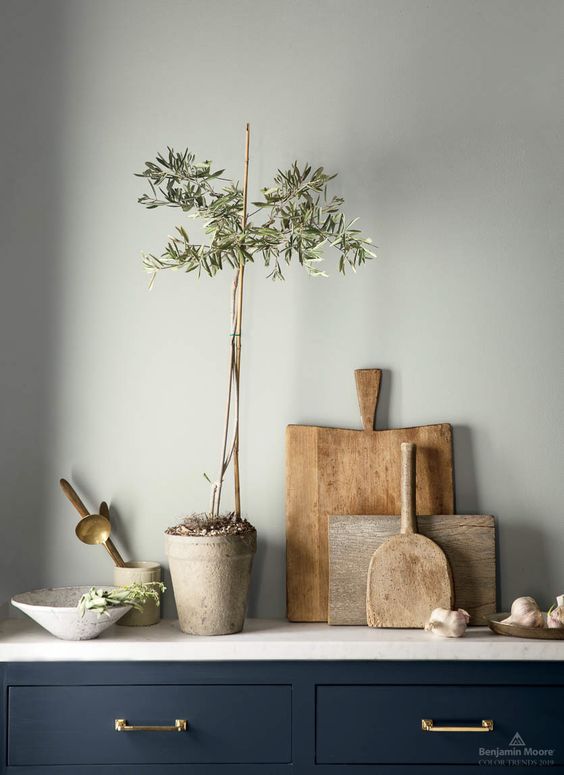
When it comes to my favourite colours navy is right behind grey and the two make a stunning pair. In this kitchen, walls in Metropolitan are paired another one of my go-to shades Benjamin Moore Hale Navy. Again, note the gold accents. It’s an unexpected choice but really warms up the space along with light woods, marble counters and plenty of natural greens.
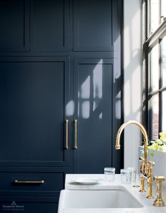
 Okay this is pretty much my dream kitchen! Hale Navy is definitely on our short list for kitchen cabinet colours and it looks stunning paired with gold hardware and marble counters.
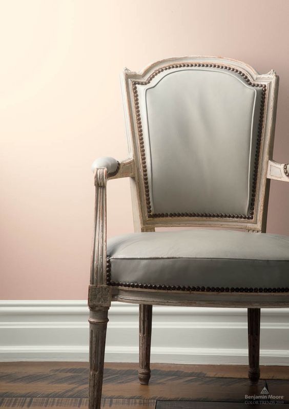
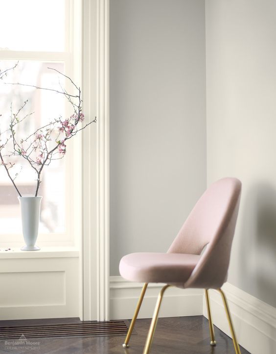
Pink & Grey
I’ve always loved the combination of pink and grey. They balance each other very well and sometimes we just need a little bit of pink in our adult lives. This cabinet painted in Metropolitan is set against background walls in Head Over Heels AF-250. We’re “head-over-heels” in love!
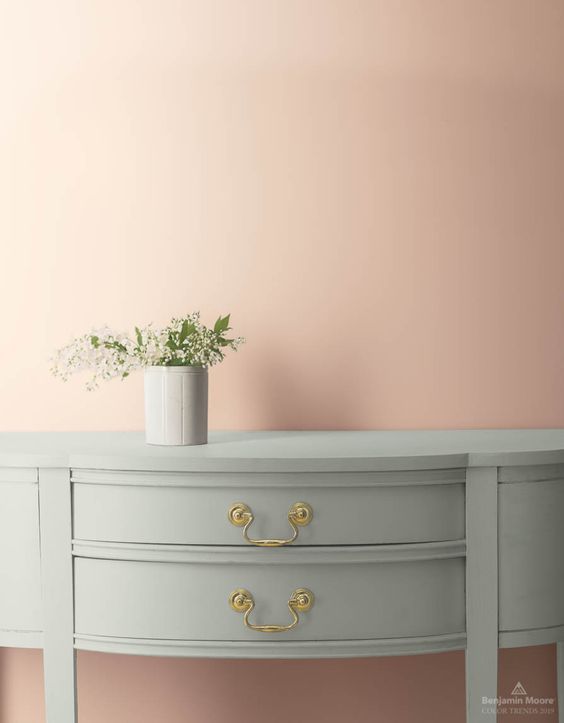
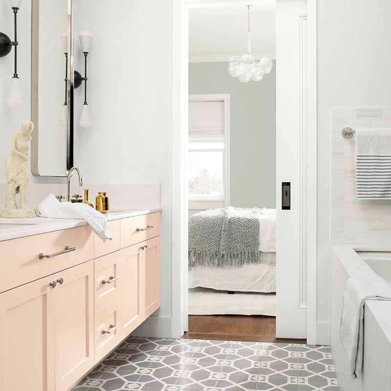
The trick to painting walls in pink in your adult space is picking the right shade. Look for tones that are softer, slightly grey or brown. Here’s another shot of Head Over Heels AF-250.
Too much pink for the walls? Try it as an accent on the bathroom vanity. It’s just the right amount of colour. Keep the rest of the space white. We love the slight hint of grey in Benjamin Moore Decorator’s White.
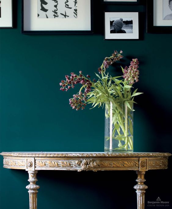
Teal
There were a couple of surprise shades in this year’s collection too. I love the colour of deep ocean – a rich teal that gives rooms a moody almost old fashioned vibe. These walls painted in Benjamin Moore Beau Green 2054-20 is stunning behind an antique gold desk and gallery wall.
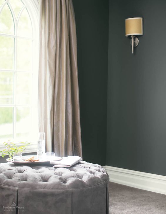
Charcoal
Over the years I have changed almost every wall paint colour in our house but our living room has remained constant. It’s not large and doesn’t have a lot of light but I painted it a deep charcoal and have loved it for almost a decade. Benjamin Moore Black Pepepr 2130-40 has very slight violet blue undertone and pairs well with creamy tones, other cool greys as well as pink!
If you’re looking for a warmer charcoal grey you can’t go wrong with Kendall Charcoal for walls, trim or cabinets.
Greige
If you’re worried all these moody shades are too much for you try Benjamin Moore Balboa Mist, which has been on my favourite “off-white paint colour” for along time. It’s a light greige perfect for all-over interiors as well as individual spaces.
Which one of these shades is your favourite? Leave us a comment below and don’t forget to Pin the images above for inspiration on your next paint project!
There’s more where this came from! See thousand of our decorating and design Pins on our boards here. If you liked this post don’t forget to check back next week to see what’s new on the blog but if you can’t wait our Facebook page is updated daily with amazing spaces, design tips and DIY projects. Or get a sneak peak at life behind the scenes at the paint store (and more stunning rooms) on our Instagram here.
If you’re local and don’t want to miss a paint sale make sure to join our mailing list by following this link (and get a little bonus for subscribing!)
 Karolina and her husband Justin De Costa took over Rowe Spurling Paint Company in 2007 after the senior De Costas, Pamela and Neviile, retired. Both Karolina and Justin studied theatre at Roger Williams University in Bristol, Rhode Island. This gave them a foundation in architecture and design while helping to fuel their creative endeavors. They continue to evolve Bermuda’s oldest paint store, providing the latest in coatings technology as well as inspiring their customers in their own home and professional projects.